Swindon design agency Jazzbones Creative has rebranded long-established Wiltshire Rural Housing Association as White Horse Housing following its acquisition of a property portfolio in Somerset.
The Melksham-based association has managed village homes in Wiltshire for more than 30 years and is committed to providing affordable homes to people on low incomes. 
It approached a number of agencies, including Jazzbones, about rebranding as a result of the property portfolio takeover.
Jazzbones has a long track record of working with charities to deliver effective branding, marketing and fundraising campaigns, with clients ranging from local charities such as Wiltshire Air Ambulance and SEQOL, to national bodies like Bible Society, National Trust and ABF The Soldiers’ Charity.
Jazzbones founder and creative director Nathan Sandhu said: “Initially, some of the board members thought we’d come in with wacky ideas because we’re a design agency with a funky name.
“But we won them over with a combination of practical advice and creative concepts that showed a real understanding of their organisation and sector. It’s never about design for design’s sake.”
Wiltshire Rural Housing Association (WRHA) CEO Steve Warran added: “We interviewed several agencies but selected Jazzbones because we liked them as people and valued their professional but inclusive approach. They wanted us as part of their team, keeping us involved throughout – a promise they kept.” 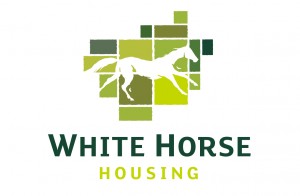
Working closely with key stakeholders at the association, Jazzbones developed three creative routes based on its rural and sustainable credentials, and also its inclusive working practices.
“All the ideas would have worked well, but one stood out as a clear winner,” said Mr Warran.
“From October 1 we are officially White Horse Housing, a name that alludes to our roots in rural Wiltshire, but is applicable throughout the South West.
“I felt it might be Mission Impossible, but with Jazzbones’ inclusive approach we have a new brand that everybody is very excited about.”
Nathan added: “We’ve kept the rural feel, even though WRHA’s geographic spread has now changed.
“The White Horse is synonymous with Wiltshire but also the South West. We’ve designed it to reflect the iconic white horses of the area without being too specific. Framed by green pastures that evoke fields or a brickwork pattern, it’s a flexible visual asset for the White Horse Housing brand moving forward.
“Sometimes charities hire us for a one-off project, like a quick-fire fundraising campaign in response to a particular event, but WRHA’s brief involved a host of disciplines: brand strategy, naming and logo design, brand identity and photography. It’s the kind of wider brief we relish at Jazzbones – especially when it’s for a good cause.”

