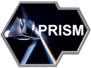
We thought BrandSoup was alone in having opinions about the advisability or otherwise of government agencies getting “creative” with logos (see our recent blog – Bonfire of the Quango Logos). But following revelations of the US NSA’s acquisitive attitude to everyone’s emails and Facebook postings, this thorny topic is now global headline news. The Washington Post, the Guardian, the internet (passim) are all concerned with just one thing: why does this top-secret surveillance program feel the need for a logo of any sort? (Followed closely by: and what on earth do they think this particular logo says about them?)
Maybe we should just gloss over the first of those questions. After a bit of head scratching, we confess we really don’t understand what a spy-operation-that-no-one-is-meant-to-know-about might hope to gain from a logo, and we’re not sure we ever will. Logos, like all brands, are traditionally used to publicise the availability of goods and services and to identify their source. Hence our puzzlement. We don’t even think the NSA is starting a sideline in the merchandise business, no matter how cool or Matrix-y their stuff might be: someone (“someone”) has recently nobbled a Zazzle store which was trying to score a fast buck off this news story. And we don’t think they were concerned about unfair competition…
Perhaps, this is all a smokescreen designed to divert attention away from their more nefarious operations. Whatever it is, we’re happy to accept that the good spooks of Fort Meade know their business better than we do, so let’s get on to question 2. That logo – what’s it all about then? And is it any good?
It’s not clear that the “PRISM” element is an acronym for anything (although even if that’s the case, no doubt some operative somewhere is working on a backronymas we speak). It’s got a certain techy and scientific flavour to it, sure, and might come across as kind of mysterious in the right circumstances, but it still manages to sound like the name of a superhero villain. “Oh no! It’s Prism! Won’t anybody stop him?” Maybe someone just thought it sounded cool.
And as for the graphics, well, “sophomoric” seems to be the consensus opinion (and that’s the polite version). The thought process probably went something like this: “We’re called PRISM so let’s use a photo of a prism! Splitting light! Just like a prism!” We know, we know, it’s easy to mock… Perhaps there’s a genuine message in the whole “refraction” thing that informs us as to the NSA’s work ethic. Something like: “just as a prism splits incoherent white light into discrete, individual streams, we at the NSA carefully separate jihadist bomb plot emails from stuff your Mum sends you about amusing cats, and we pride ourselves on never getting the two confused.” Or perhaps they’re all Pink Floyd fans (in which case we should at least be grateful they didn’t just cut-and-paste Dark Side of the Moon).
Latest word is that the artwork comes with impeccable scientific credentials – the creator of the prism/refraction device is apparently none other than our own Adam Hart-Davies. He took the original photo and has chosen to make it freely available on his website, so kudos to the NSA for opting for a free-to-use artwork. Whatever their views on breaking lesser laws, copyright is clearly sacrosanct in their eyes! But what’s that thing sitting around it? A key? A cell? A circuit board? An oblique reference to 60’s B-movie sci-fi aesthetics? Something you’d expect to see on the HQ of an all-powerful clandestine operation? Ahem. If it all seems a little too clichéd for comfort, a case of life imitating art, The Guardian seems to have put its finger on it: “it’s like something a Bond villain might put on his website”.
This is all a huge distraction from the real story – if the US and/or UK Government really have been tapping all our communications for the last decade, that’s an immense breach of trust, law, ethics, you name it. But it also goes to reinforce some interesting truths about brands: Brands are cool. Everyone wants brands. But good brands don’t grow on trees, and bad brands are more commonplace than we’d like to think. Oh, and the public sector seems to have a thing for really, really bad brands.
BrandSoup is a hearty concoction of crunchy facts, delicious ideas and fresh opinions from the media team at law firm Thrings. For previous articles go to http://blog.thrings.com/


